
IT services logo refresh
Pilot IQ
Less noise, more outcomes.
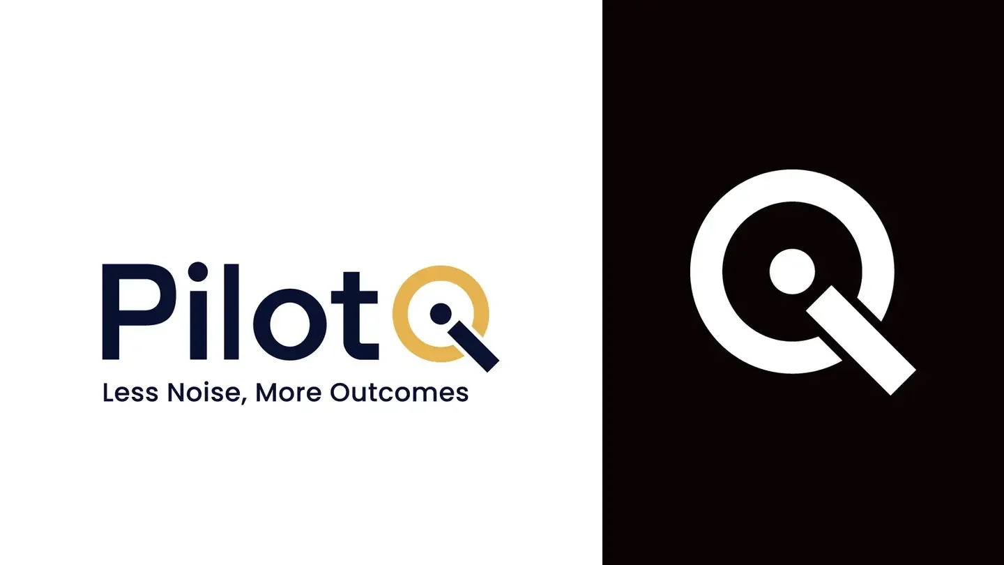
Pilot IQ provide managed IT services for UK SMEs: secure workspaces, zero compromise. They manage the technology so their clients can focus on growth, reducing risk, improving uptime and cutting wasted spend.
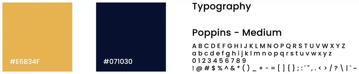
They wanted a fresh, updated version of their logo. The refresh puts the whole name into one letter: the Q is a gold ring, and the dot and the bar that make its tail also make an i, so the IQ sits inside a single shape. Pilot is set in a heavy, open geometric sans in deep navy, and the strapline sits underneath in Poppins Medium. The mark works on its own as the favicon.
- A refreshed wordmark with the IQ built into one letter
- The primary logo with and without the strapline
- Each version in navy and gold, and in white on black
- The Q on its own as a logo mark and a favicon
- A palette of gold and deep navy, with Poppins Medium for type
One letter carries the name. The dot and the tail make an i, and the ring around them makes the Q.
The ideaThe logo system
The primary logo carries the strapline; the version without it is for small spaces and anywhere the line would be too small to read. Both come in navy and gold and in white on black, and the Q works on its own as the mark.

Colour and type
Got a project like this?
Tell me what you're building and get a clear, fixed quote within one working day.