
Driveway firm rebrand & website
Global Outdoor Design
Kerb appeal starts with the brand.
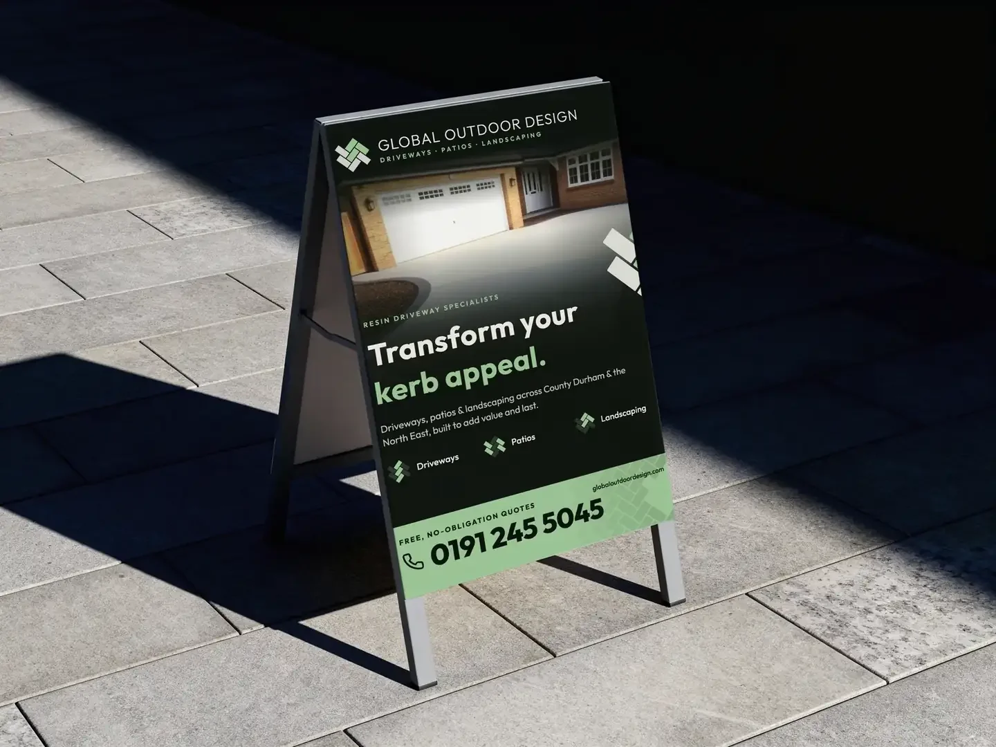
Global Outdoor Design delivers driveways, patios and roofing across County Durham and the North East, from a base near Ferryhill and Chilton. Work built to improve kerb appeal, add value and stand the test of time.
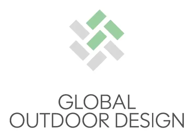
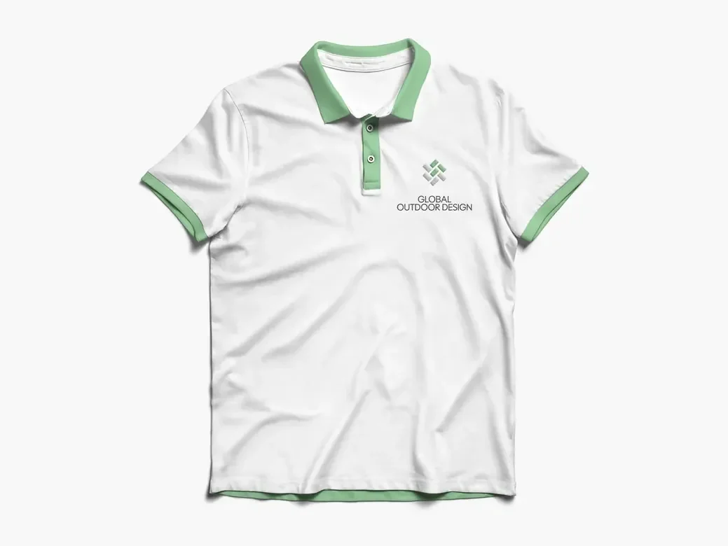
They wanted the full job: a new brand from the ground up and a website to go with it. The mark is seven blocks laid in a diamond, the way a herringbone drive goes down, four in stone grey and three in green for the planting. It comes as a full lockup, a stacked version, a single colour mark and a favicon, so it works on a van, a polo shirt, a pavement sign and a browser tab. The palette is two greys and a soft green. The type is Polymath Display Light, a clean geometric face that stays light on a sign and on a screen.
- A paving mark: seven blocks in a diamond, in grey and green
- Primary and stacked lockups, each in colour, black and white on black
- The mark on its own as a favicon, checked down to sixteen pixels
- A palette of two greys and one green, set in Polymath Display Light
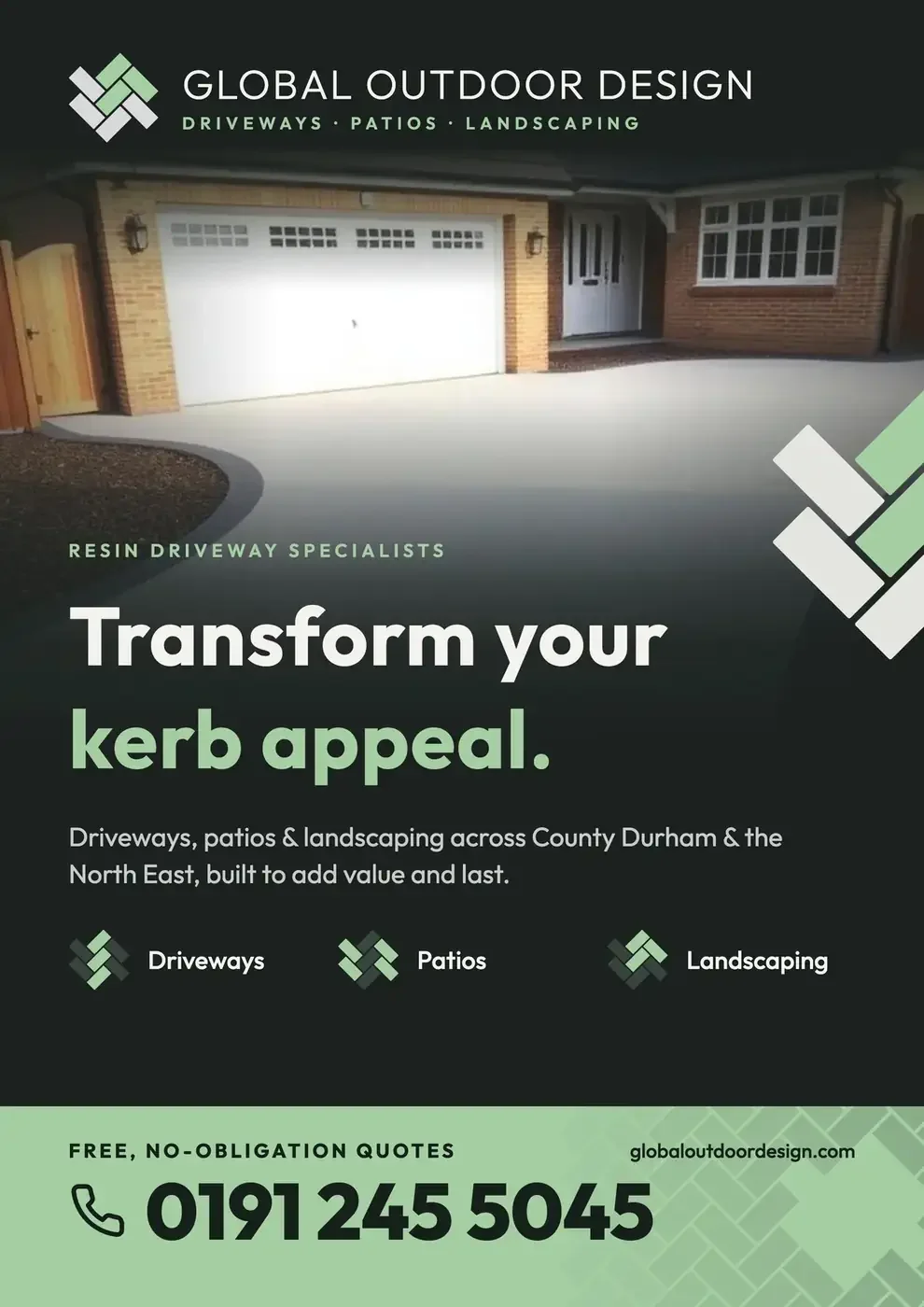
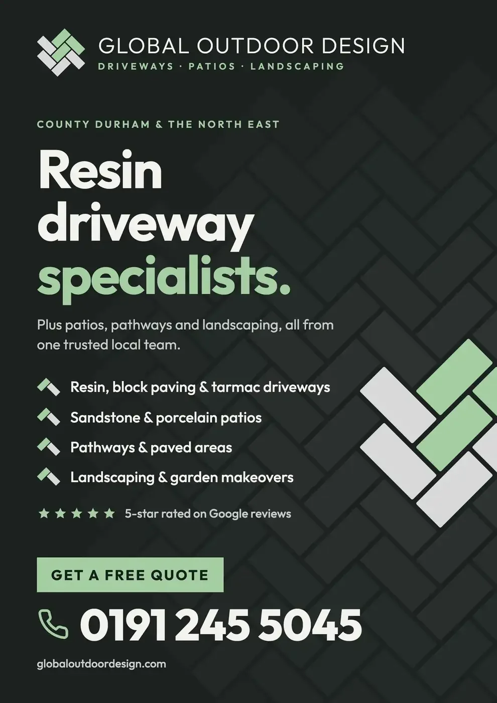
- Two routes for the pavement sign, one photo led and one services led
- Applied to workwear and a pavement sign, with a website to follow
The mark is a drive, laid small. Seven blocks in the pattern their customers will be standing on, drawn once and used everywhere.
The approachThe logo system
One mark, built to work in every setting it will meet: the full lockup for letterheads and vans, the stacked version for anything square, and each of them in colour, in black and in white on black.






In use
Got a project like this?
Tell me what you're building and get a clear, fixed quote within one working day.