
Fitness logo, identity & social
McDermott Fitness Academy
Educating stronger coaches.
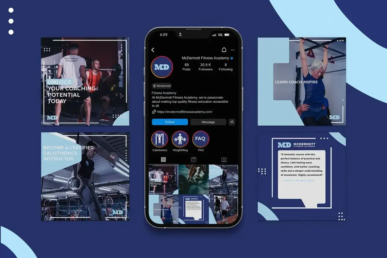
McDermott Fitness Academy set out to raise the standard of fitness education and make health and wellness genuinely accessible through simplified, well-structured courses. The brand had to carry that ambition: recognisable and attractive enough to inspire lifestyle transformation, but clear enough that its offering is never in doubt.
The work explored two distinct routes. Both were built to hold together across every touchpoint, from an Instagram grid to a coach's training kit.
- Two full identity concepts, each with logo, palette and applications
- Social templates and a complete Instagram grid system
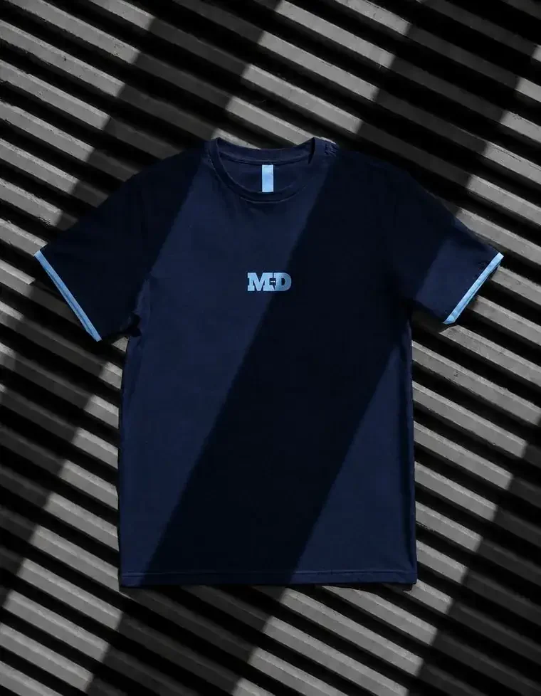
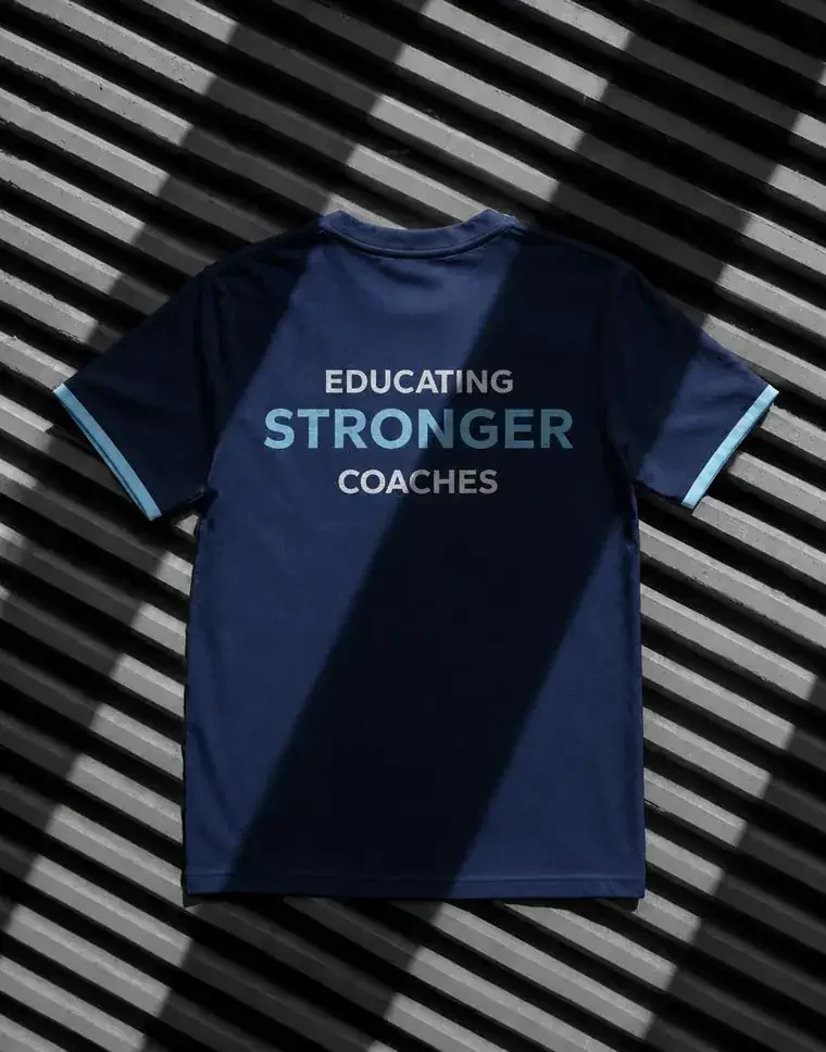
- Training apparel: front mark and back strapline
- Consistent brand language across every touchpoint
Fitness education treated as a credible institution rather than a gym brand, so a qualification from it reads as something you'd put on a CV.
The approachBrand objectives
- Create a strong brand that encompasses education and accessibility within fitness
- Create a cohesive brand language and apply it consistently across all touchpoints
- Clarify the brand's offering and purpose
Concept 01: The speech mark
An MD monogram with a speech bubble built into the counter: education as conversation rather than instruction. Navy and sky blue keep it academic but energetic.

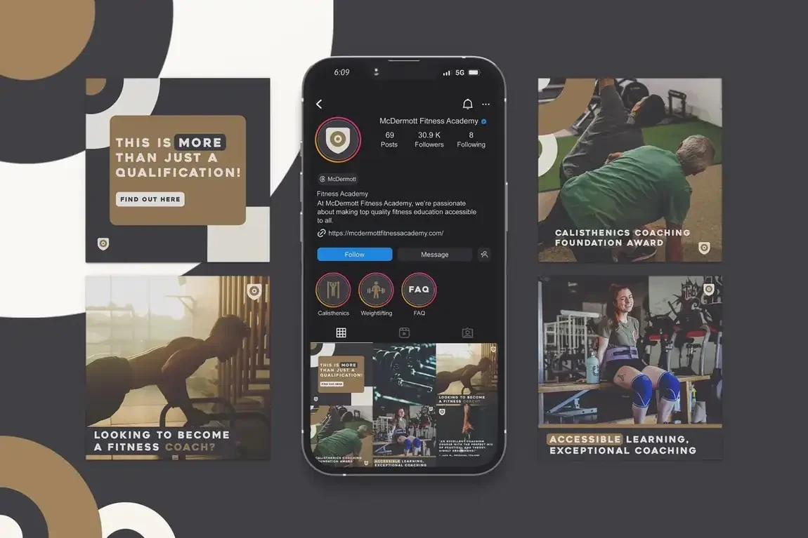
Concept 02: The target
A shield and target mark, leaning on accreditation and precision. Warm gold against charcoal gives it weight and a more premium, institutional feel.


Got a project like this?
Tell me what you're building and get a clear, fixed quote within one working day.