
Cleaning logo, livery & web
KSL Commercial Cleaning
Professional, compliant, trusted.
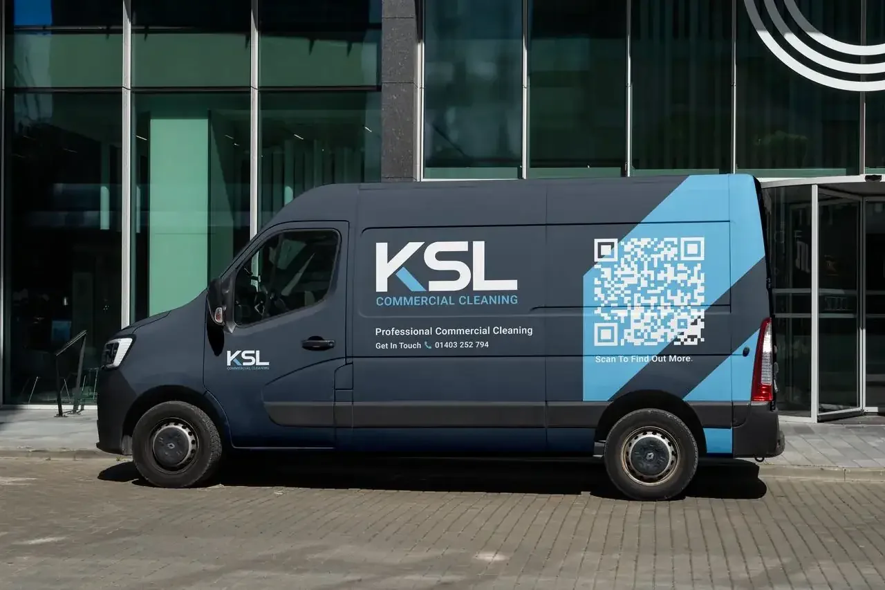
KSL is a UK provider of professional cleaning and facilities services, supporting offices, construction sites, industrial facilities and commercial properties across London and the South East.
The brief was to modernise a brand that had to work as hard on the side of a van as it does on a tender document. The identity leans on a single idea, the angled stroke cut through the K, which reads as a squeegee blade and carries across every application as the brand's signature mark.
- A logo system: the primary logo three ways, three variations, the mark and a favicon
- Navy, sky and white palette built for vehicle livery and workwear
- Van livery with QR code straight through to the site
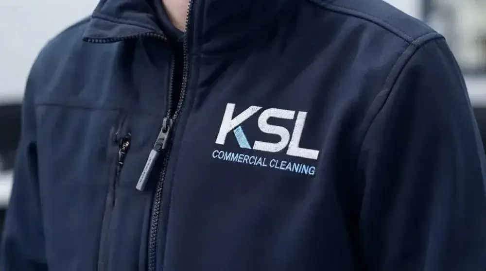
- Embroidered uniform for on-site staff
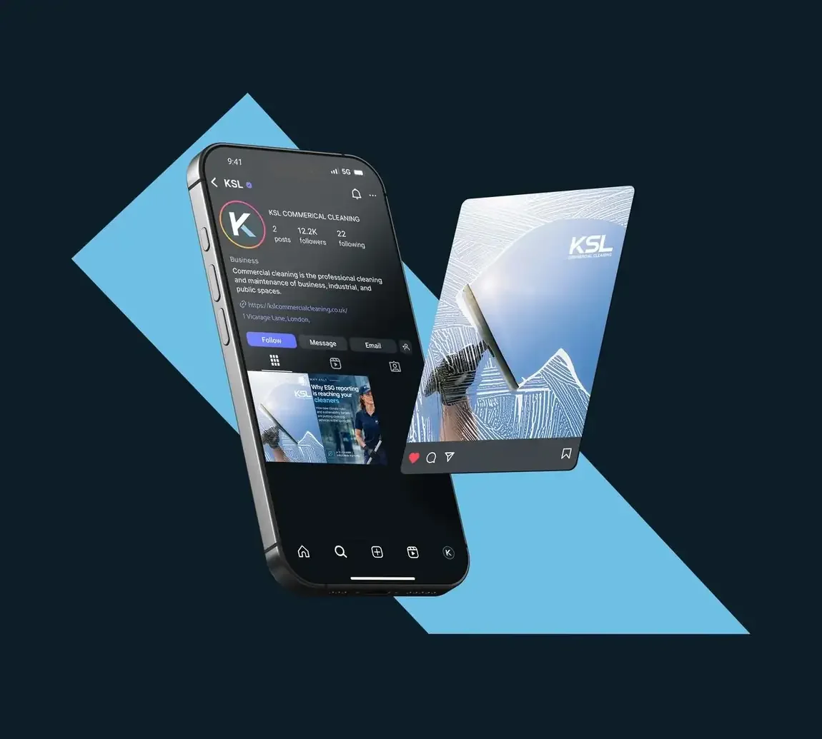
- Social templates and a modern website direction
A mark that works at sixty miles an hour on a motorway and at ten point on a tender document. The same brand either way.
The approachBrand objectives
- Modernise the brand: a fresh, professional identity reflecting KSL's quality and expertise
- Build trust and credibility: position KSL as a reliable, compliant cleaning partner
- Strengthen the digital presence with a modern site that communicates the services clearly
The logo system
One mark, ready for whatever it lands on: the primary logo on navy, black and white, three variations for when the background is already blue or the job prints in one colour, and the stroke through the K on its own as the favicon.



In use
Got a project like this?
Tell me what you're building and get a clear, fixed quote within one working day.